

StreamAlive Website Redesign
Expertise
Platforms
Deliverables
Project Overview
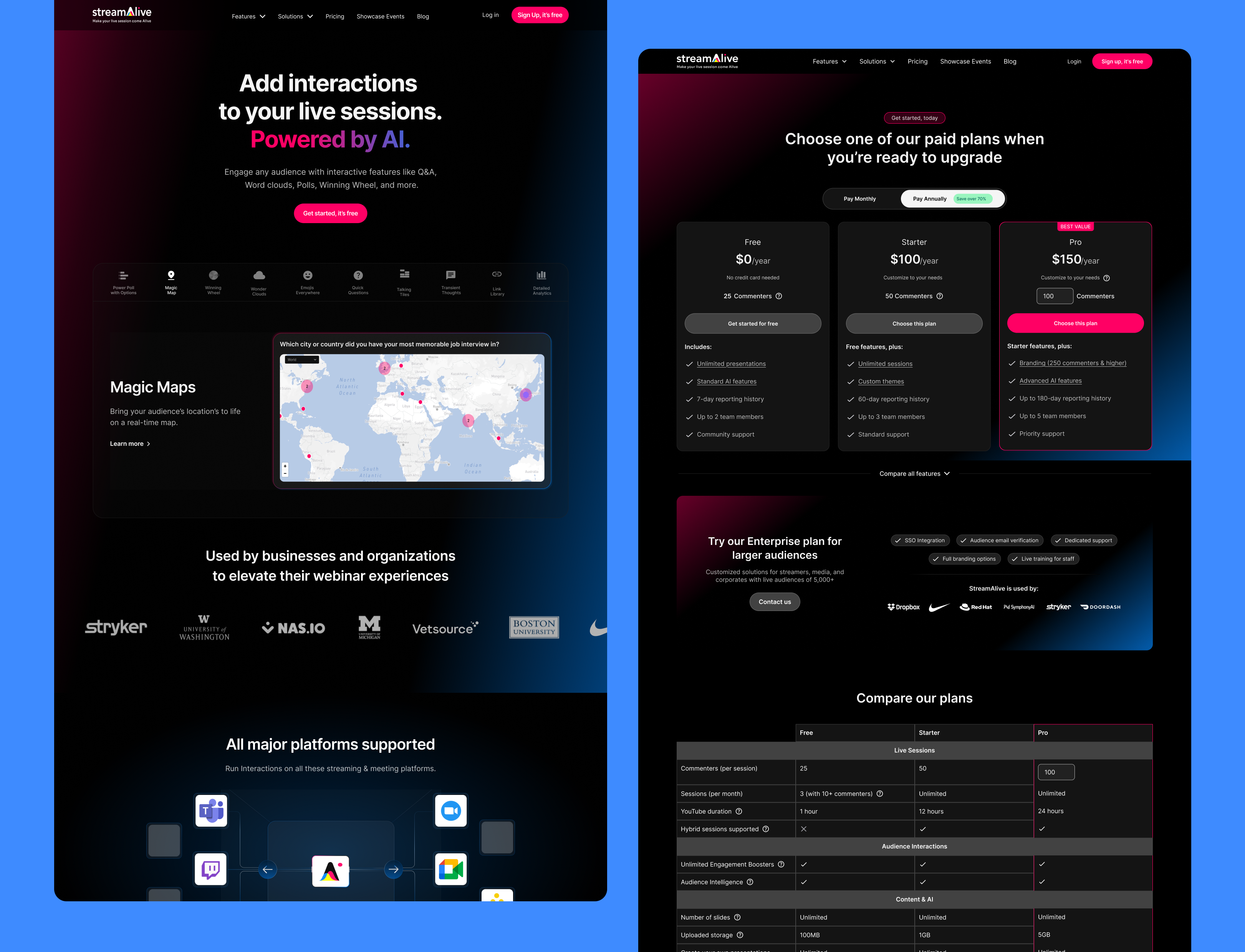
StreamAlive is a platform that transforms live audiences—from meetings to webinars—into active, chat-driven participants. But their old website didn’t show that. It lacked clarity, structure, and any real feel for how the product worked. My goal was to redesign and rebuild the entire website—homepage, pricing, features, and more—to bring the product’s magic to life and increase conversions.
The Problem
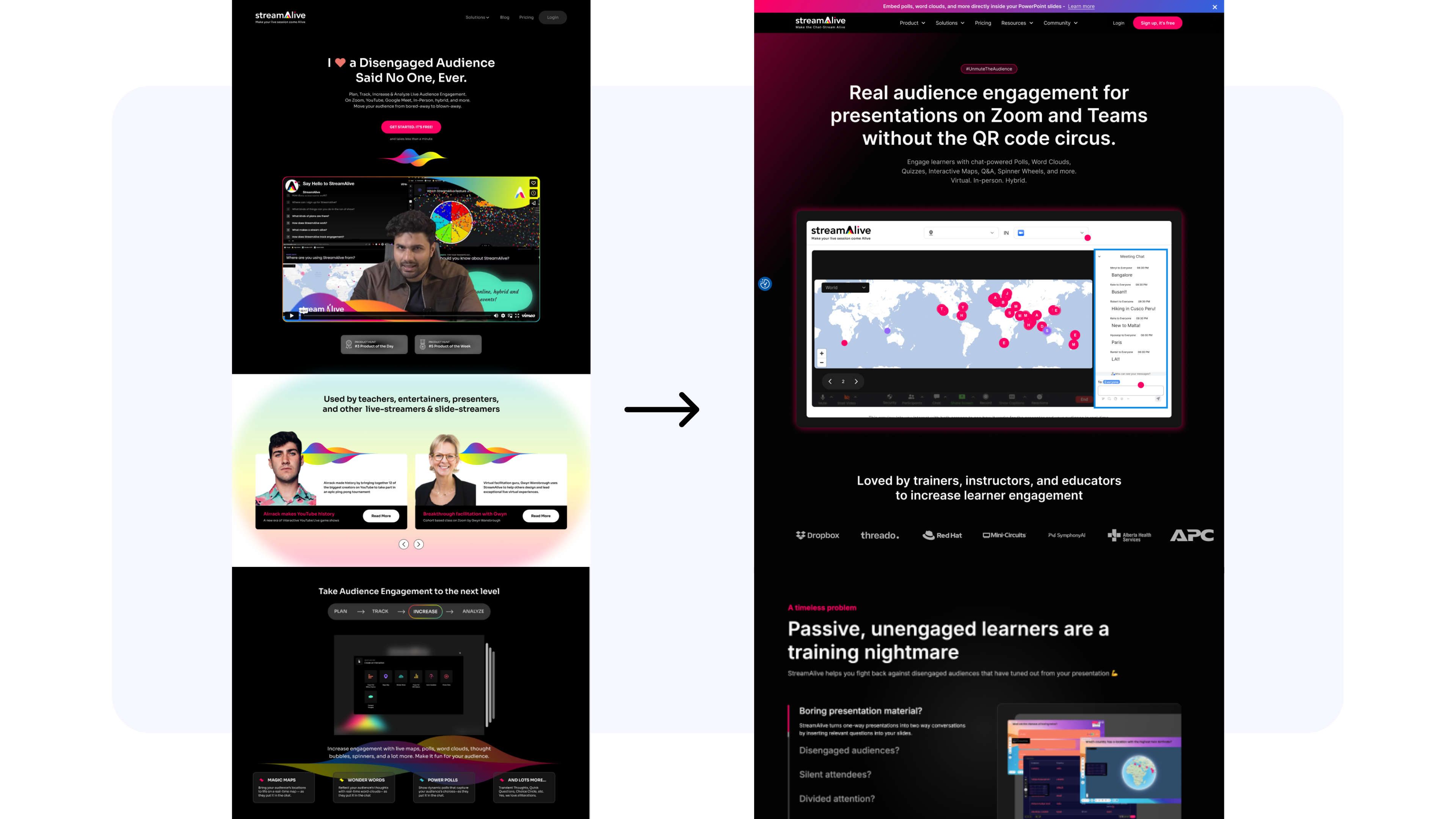
Despite being a powerful AI-driven engagement platform, the old website failed to communicate StreamAlive’s value. Visitors couldn’t understand what the product did, had no way to try it, and were met with long blocks of text and limited visuals. The pricing page didn’t guide decision-making, and the homepage lacked interactivity—ironically, for a product all about interaction.
The Goal
- Create a homepage that clearly explains how StreamAlive works
- Let users interact with the product immediately—without logging in
- Redesign the pricing page to help users compare plans easily
- Visually show platform support, features, and what makes StreamAlive different
- Increase free trial signups through an improved experience
My Role as a UX/UI Designer
I worked end-to-end on this project: from UX and wireframing in Figma to full implementation in Webflow. I handled content design, animation, layout, visual storytelling, and custom code—working closely with the founders and dev team to ensure alignment with the brand.
Responsibilities
- Audited the old site for UX gaps
- Designed all key website pages (Homepage, Pricing, Features, etc.)
- Built the new site in Webflow with advanced interactions
- Created custom animations, tab elements, and responsive layouts
- Designed and implemented live product simulations on the homepage
- Wrote UX-friendly microcopy and CTAs
User Research Summary
I reviewed customer feedback, support queries, and onboarding behavior to understand what confused users. I also observed how new visitors navigated the old site via session recordings and heatmaps. This helped prioritize areas of friction—mainly around understanding how StreamAlive works and what makes it different from traditional engagement tools like Slido or Poll Everywhere.
User Pain Points
- “I’m not sure what this does exactly.”
- “Is this a presentation tool or a plugin?”
- “What platforms does it support?”
- “I wish I could try it out before signing up.”
- “I can’t compare the plans—what’s included in each?”
Usability Study Findings – Round 1
Before the redesign, users often bounced quickly. Heatmaps showed low engagement with key sections, and interviews revealed confusion about product value. People wanted visuals and a way to try the product—but the old homepage offered neither.
Usability Study Findings – Round 2
After launch, users engaged more with interactive elements like the sandbox and AI generator. Feature tabs with GIFs helped people understand core functionality quickly. The redesigned pricing page led to longer time on site and more trial clicks. The feedback was clear: the site felt easier, faster, and more exciting to explore.
Final Design Highlights
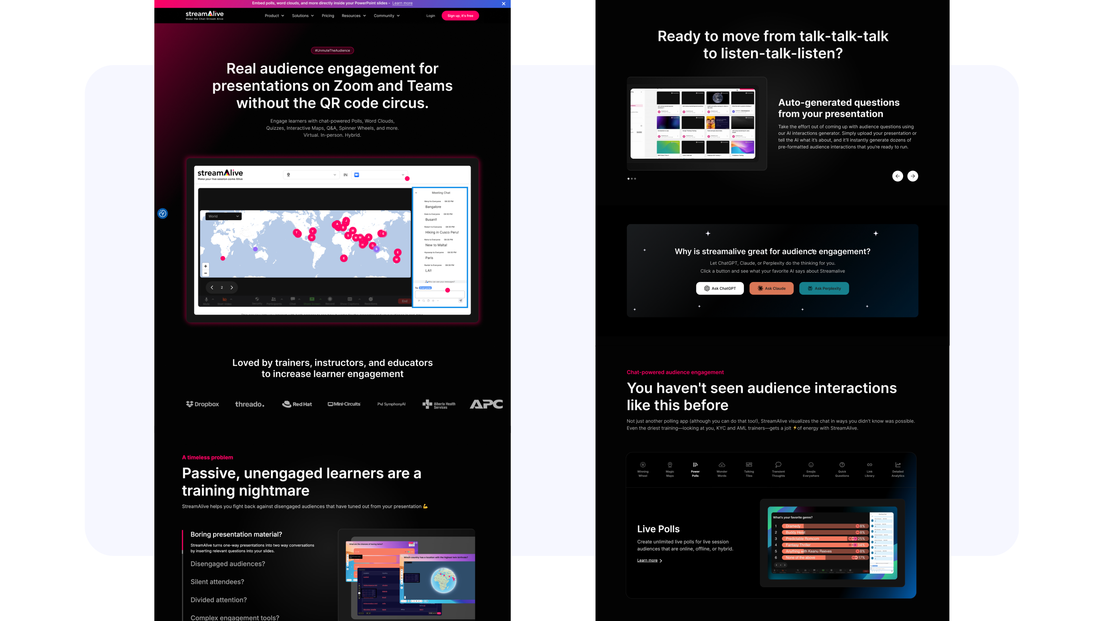
Homepage:
- Live sandbox in the hero section (try features instantly)
- AI-powered interaction generator (simulate your own session)
- Interactive feature tabs with GIFs (Polls, Word Clouds, Chat-to-Slide, etc.)
- Visuals showing platform support (Zoom, YouTube Live, Google Meet, Teams, Twitch, In-person)
- “Why StreamAlive is Different” section
- Testimonials and trust-building CTAs
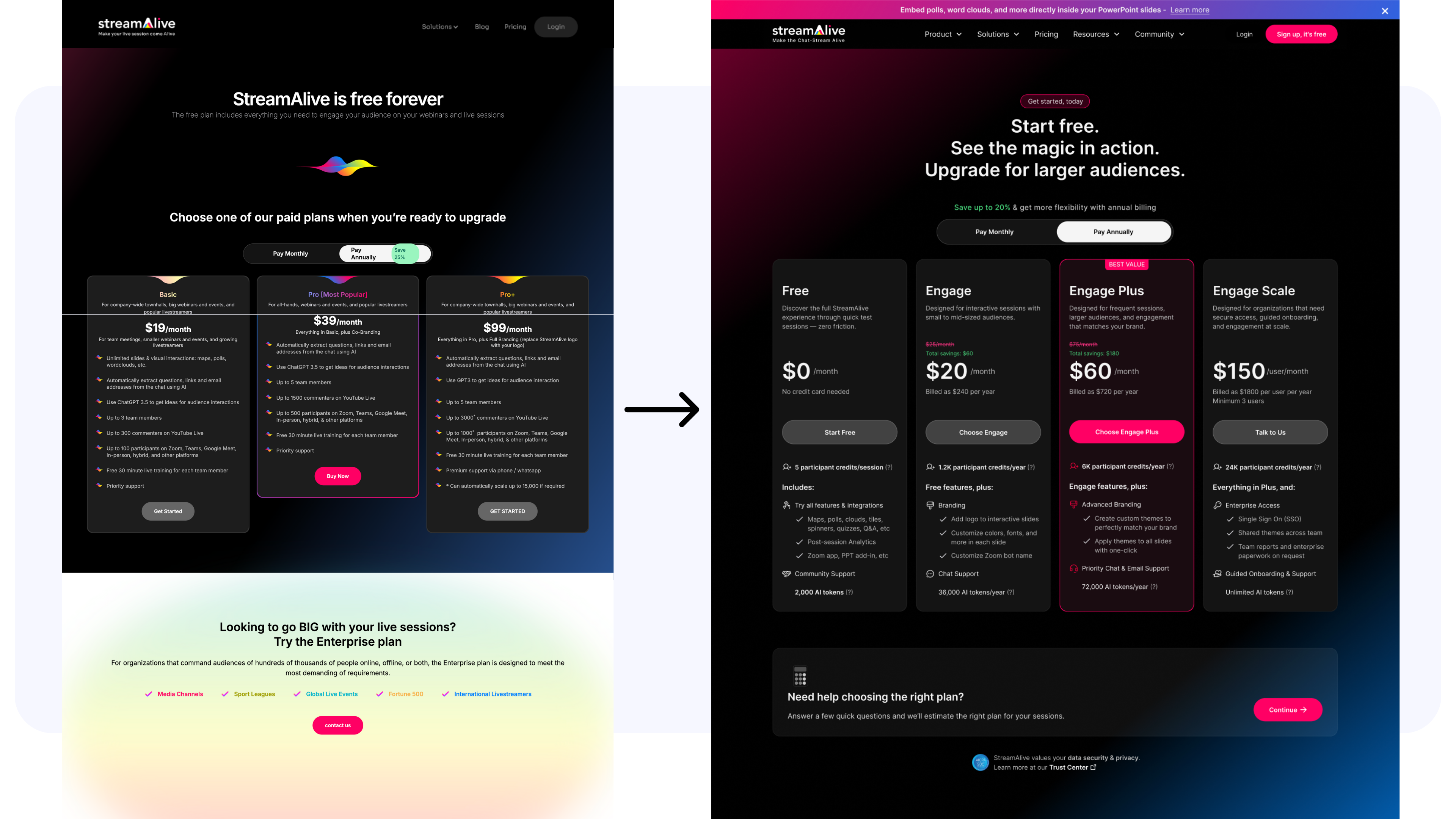
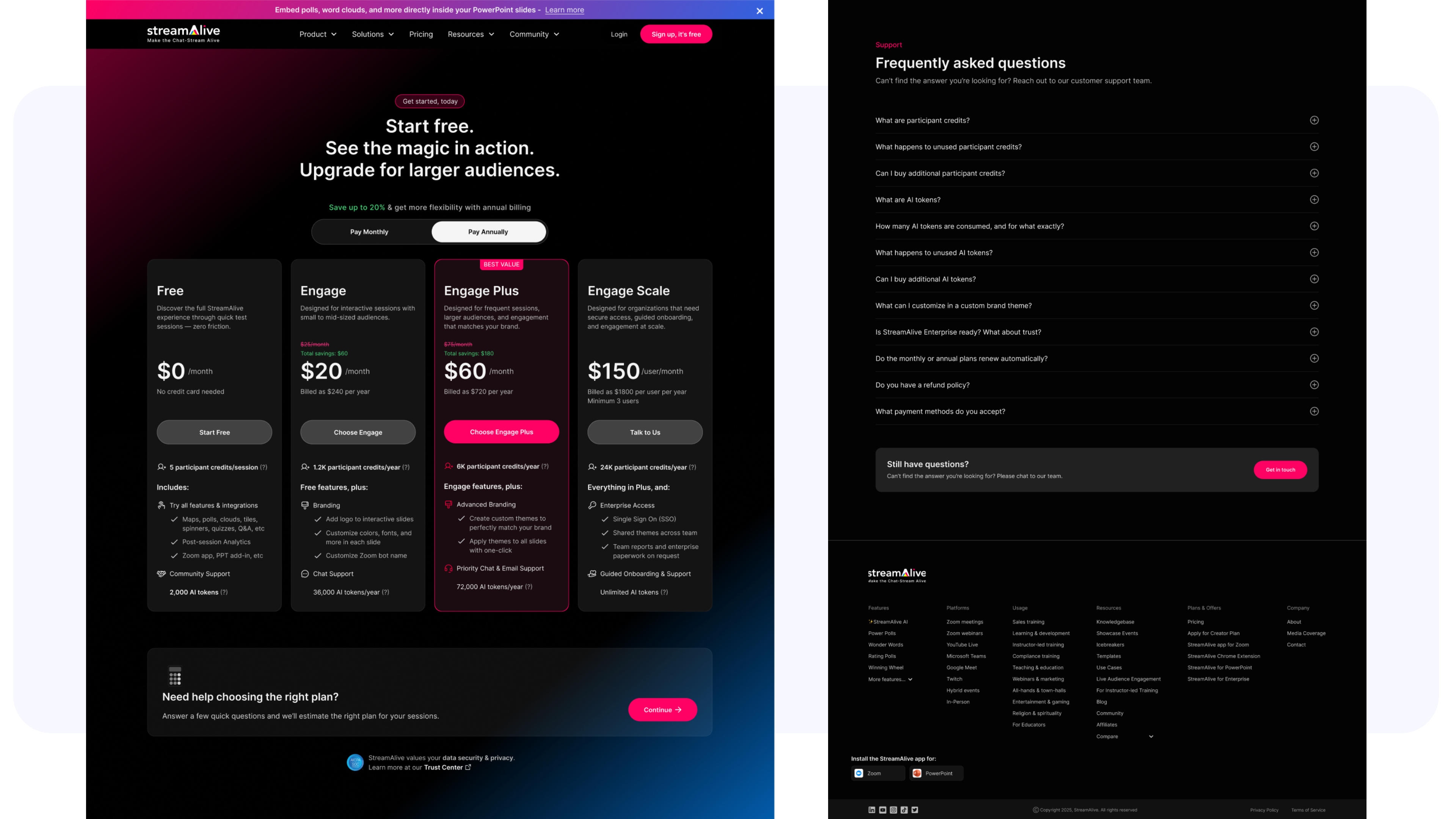
Pricing Page:
- Clear side-by-side plan comparison (Free, Basic, Pro, Enterprise)
- Visual icons and tooltips to clarify features
- Mobile-friendly layout for clean readability
- Strong CTAs encouraging signups
Takeaways – Impact
The new website became an extension of the product itself. Visitors could interact with it instantly, understand the core value, and feel the excitement StreamAlive brings to any live session. The redesign led to a major boost in:
- Free trial signups
- Time spent on site
- Engagement with interactive elements
- Trust in the brand and product
The site now unites marketing, product, and UX into a seamless experience.
What I Learned from This Project
Sometimes, the best demo is the website. This project taught me the power of show, don’t tell. By embedding live elements like the sandbox, AI generator, and feature tabs, we gave visitors a true taste of the product—without needing a sales rep or walkthrough. It also taught me how to balance story, structure, and interactivity within a modern web experience.
Next Steps
- Continue iterating based on analytics and user feedback
- Add real-time testimonials and user-generated content
- Expand interactive demos to feature pages
- Integrate deeper onboarding CTAs throughout the site
Conclusion
Redesigning StreamAlive’s website wasn’t just a facelift—it was a functional rethinking of how to introduce, explain, and let users experience a complex product in seconds. By merging storytelling with real interaction, we created a homepage that not only informs but engages—turning passive scrollers into curious participants. And for a platform built to “unmute the audience,” that’s the perfect place to start.
Curious to See More? Explore More Projects