

Flair Airline Website Redesign
Expertise
Platforms
Deliverables
Project Overview
Flair Airlines is known for affordable travel—but their website didn’t reflect that ease or accessibility. The booking process was cluttered, especially when choosing roundtrip flights. My goal as a UX/UI designer was to rethink the booking experience, clean up the layout, and reduce confusion—so that the process felt as smooth as the travel itself.
The Problem
The biggest issue was with roundtrip bookings. Users had to select both legs of the trip on the same screen, making the interface feel overwhelming and unclear. This lack of structure led to frequent user confusion, difficulty comparing flights, and a higher risk of booking mistakes.

The Goal
The main goals of this redesign were:
- Separate the roundtrip selection into two clear steps
- Simplify the layout for better scanning and comparison
- Add a sense of progress and structure to guide users smoothly
The ultimate aim was to make booking easier, faster, and more enjoyable.
My Role as a UX/UI Designer
I was the sole designer on this project, responsible for both UX strategy and UI design. I handled everything from user analysis to high-fidelity mockups—bringing the redesigned experience to life using Figma.
Responsibilities
- Analyzed existing booking flows and user pain points
- Restructured the roundtrip flow into separate steps
- Designed responsive layouts and intuitive flight cards
- Created a clear visual hierarchy for price, time, and baggage info
- Prototyped the full booking journey for usability testing
User Research Summary
I reviewed the booking process myself and studied feedback from real users through online reviews and support forums. This qualitative research helped validate the frustrations and pinpoint which moments in the flow caused the most friction.
User Pain Points
Usability Study Findings – Round 1
In the first round of informal testing, users consistently struggled to differentiate between departure and return flight options. Most felt unsure of what they had selected and wanted the steps broken down.
Feedback included:
“Wait, is this for the way there or the way back?”
“There’s too much going on here. I feel like I might click the wrong one.”
Usability Study Findings – Round 2
After implementing a two-step process and clearer visuals, the second round showed noticeable improvement. Users moved through the process more confidently and appreciated the simplified layout.
Feedback included:
“This feels much easier to follow.”
“I like how it walks you through—it’s way less stressful now.”
Final Design Highlights
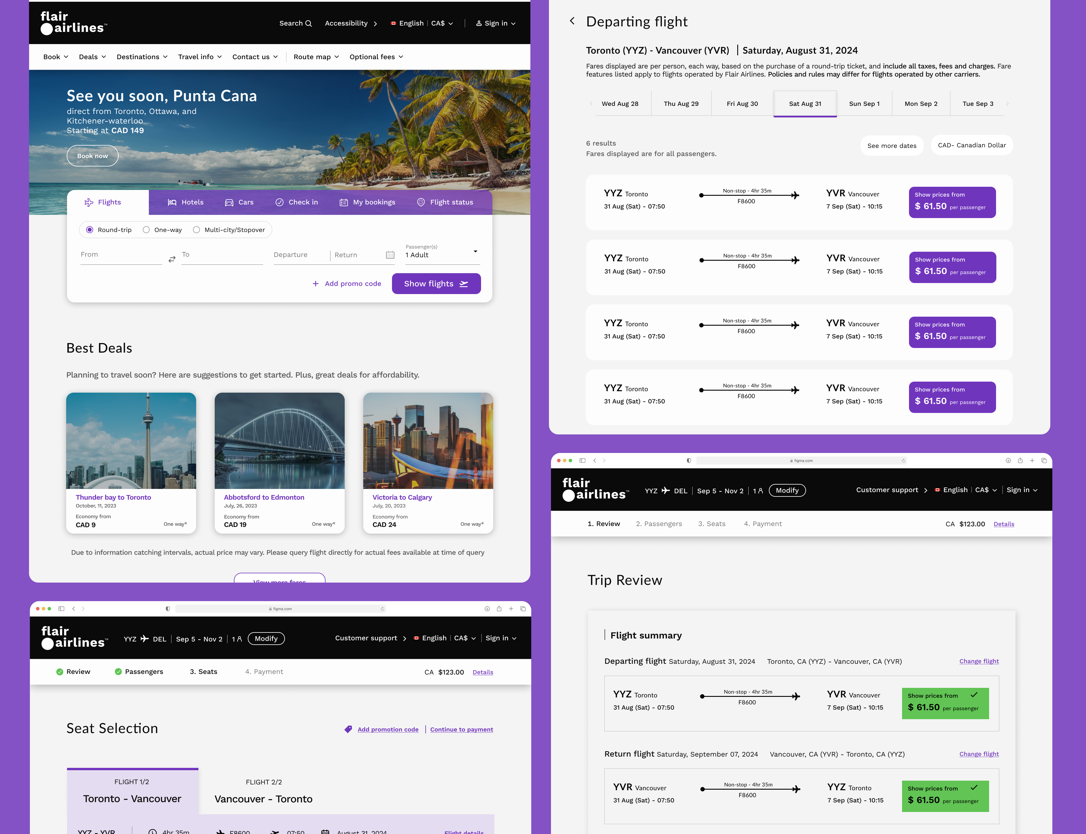
- Two-step booking flow: Departure and return flights are selected on separate screens
- Simplified flight cards: Key info (like times, pricing, and baggage) is easier to scan
- Progress bar: Users know exactly where they are in the journey
- Modern visual hierarchy: Clean, intuitive layout across all devices
Takeaways – Impact
This redesign helped reduce friction in the booking flow, which directly supports better user satisfaction and fewer abandoned carts. The cleaner structure made it easier for users to complete a booking without second-guessing, and helped Flair’s digital presence feel more aligned with its low-cost, user-first brand.
What I Learned from This Project
This project taught me the power of clarity. When you break complex flows into smaller, manageable steps, users feel more at ease. It reminded me that a user-friendly experience is often not about adding more—but removing what gets in the way.
Next Steps
- Expand usability testing to more users, including mobile-specific feedback
- Consider adding filters or “Best Value” tags to assist with decision-making
- Explore redesigning other parts of the site like seat selection or payment screens to maintain consistency
Conclusion
This redesign wasn’t about adding bells and whistles—it was about giving users room to breathe. By simplifying the booking flow and letting users move one step at a time, we created a more focused, less stressful experience. It’s not just better UX—it’s a better first impression of the brand. And that’s something every traveler deserves.
Curious to See More? Explore More Projects