

A&W Mobile App Redesign
Expertise
Platforms
Deliverables
Project Overview
A&W’s mobile app was falling short when it came to user experience. Customers couldn’t easily redeem coupons, there was no in-app delivery, and order tracking was missing. This redesign aimed to make the app easier, faster, and more useful for everyday users.
The Problem
Users faced key challenges:
- Couldn’t use digital coupons inside the app
- Had to switch to other apps for delivery
- No updates on order status
This caused frustration and made the app feel outdated and inconvenient.

The Goal
To redesign the A&W app by:
- Adding in-app coupon access and redemption
- Integrating a built-in delivery system
- Showing live order status updates
The goal was to make the app more helpful and enjoyable to use.
My Role as a UX/UI Designer
I led the UX/UI redesign from start to finish—identifying problems, brainstorming solutions, designing the new interface, and creating the final prototype. I worked independently and focused on user needs at every step.
Responsibilities
- Reviewed user feedback and app reviews
- Outlined key feature improvements
- Designed the full app experience (UI/UX)
- Created the final interactive prototype
User Research Summary
I analyzed app store reviews and user comments online to gather feedback. This helped me understand real pain points and what users expected from a modern food-ordering app.
User Pain Points
- “No coupons? Why even have the app?”
- “Had to use SkipTheDishes instead.”
- “Didn’t know if my order was even coming.”
These insights made it clear what needed to be fixed.
Usability Study Findings – Round 1
I tested the first prototype with a few users and noticed:
- Users loved how easy the coupon system was
- Some weren’t sure how to start an order
- A few wanted clearer delivery time estimates
I used this feedback to tweak the navigation and delivery progress bar.
Usability Study Findings – Round 2
After refining the design:
- Users said the app felt faster and more modern
- The new delivery flow was easy to follow
- They liked seeing exactly where their order was
This showed the redesign worked and solved major problems.
Final Design Highlights
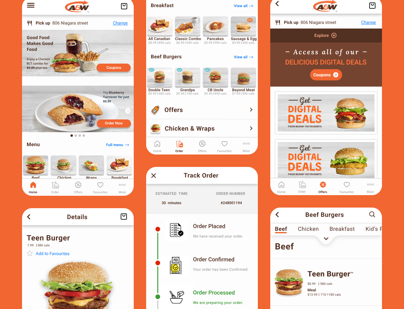
- Digital coupons: Users can now view and redeem deals with one tap.
- In-app delivery: No more switching to another app—everything is built in.
- Order tracking: Users see live updates so they know exactly when their food will arrive.
- Streamlined navigation: Clean, clear paths from homepage to checkout.
- Visual consistency: A design system aligned with A&W’s branding was applied throughout.
Takeaways – Impact
The redesign created a smoother, more rewarding app experience. While it’s a concept project, the design could help increase customer retention and in-app sales for A&W if implemented.
What I Learned from This Project
This project taught me that:
- Great UX is often about removing small annoyances
- Even without formal research tools, listening to real users makes a big difference
- A clean, simple design can have a powerful impact on the user experience
Next Steps
If I continued this project, I’d:
- Add loyalty rewards integration
- Explore dark mode for better accessibility
- Conduct more in-depth A/B testing with live users
Conclusion
This case study is a reminder that thoughtful design can turn a frustrating app into a helpful one. Even without access to the full original process, I focused on understanding the real user needs and built a solution that feels simple, modern, and easy to use. That’s what good UX is all about.
Curious to See More? Explore More Projects